H
ello guys. How are you all? I hope you are all well. I came again with a post. Let’s go..
তো এই পোস্টে শেয়ার করবে ১০ টি Border Animation কোড। যা দেখতে অনেকই সুন্দর।
এগুলো আপনি আপনার Animated ওয়েবসাইট এ ব্যবহার করতে পারেন।
তো চলুন শুরু করা যাক।
This code designs a responsive image gallery with hover effects. Padding creates dynamic spacing. Halves the padding on hover for a zoom-like effect.
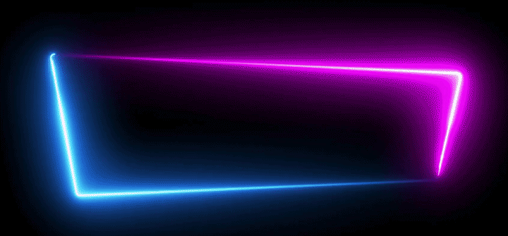
Using the @property rule, the gradient angle is made animatable. A keyframes animation rotates the gradient, which is applied to the outer border with a conic gradient. The animation starts when hovering over the element, with the inner content area using a static linear gradient.
This code creates a visually dynamic card component with a rotating conic-gradient border and various interactive styles.
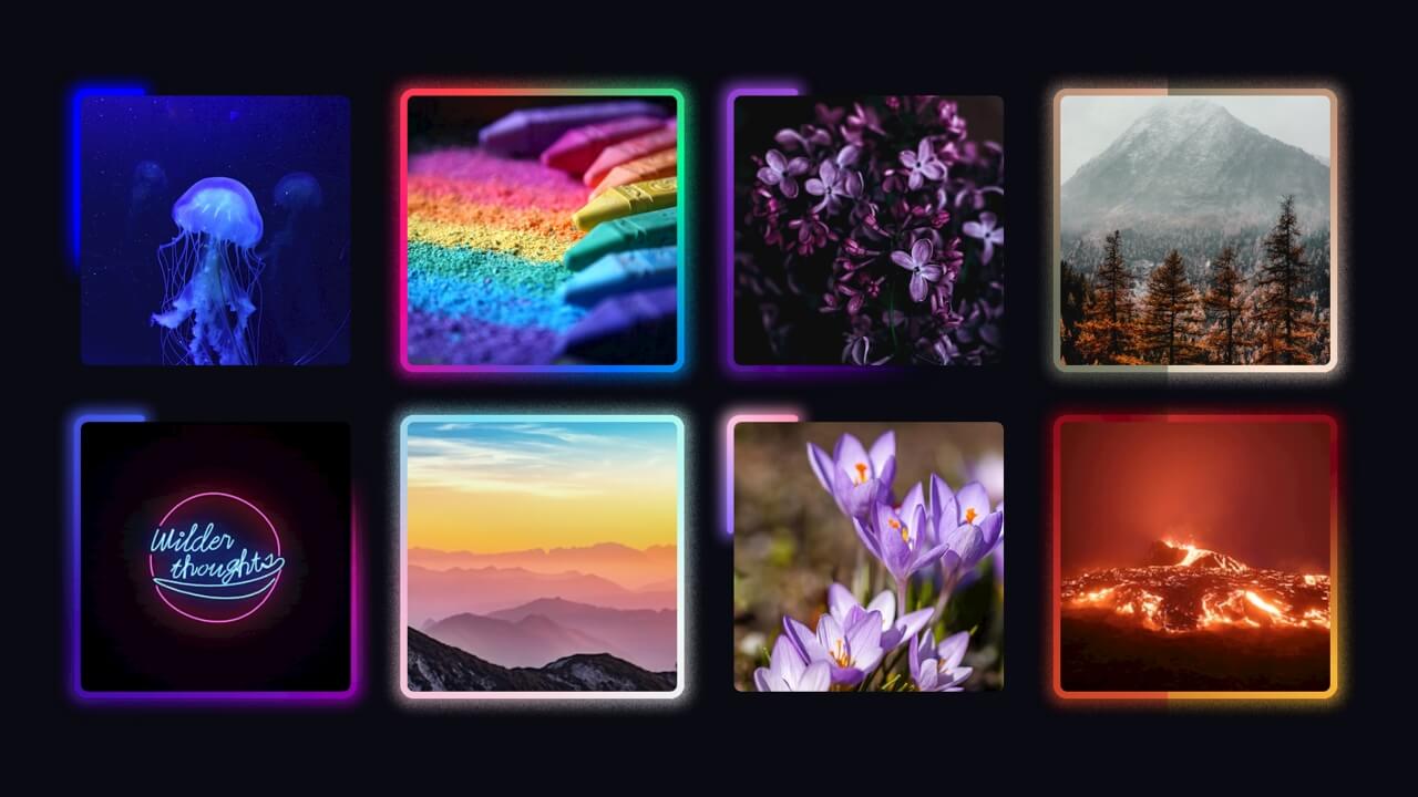
a grid layout with a centered image and a custom border effect on hover. The <div class="container"> holds the image and a <div class="border"> element with a unique ‘squircle’ shape defined by the clip-path property. On hovering the container, the border expands, changes opacity, and creates a glowing effect using shadows.
Box 1: Features a rotating conic gradient as a border, creating a colorful border animation using –border-angle. The border is animated in a full circle with hues cycling every 2 seconds.
Box 2: Uses a conic gradient for the border that transitions between a custom background color (–bg) and white, creating a dynamic effect.
Box 3: Has a circular border with alternating color segments using repeating-conic-gradient. It also features two pseudo-elements (::before and ::after) for additional border effects and animations.
This code defines a complex layout with interactive animations and responsive typography using CSS custom properties (variables) and container queries. The .trail class animates a gradient path that moves infinitely, controlled by a keyframe animation. The @container query adjusts animation speed based on the container’s width.
This CSS and HTML code creates an animated, interactive image grid with glowing borders and a gradient effect applied to each image using CSS and SVG filters. CSS custom properties control animations and styles like angles, border size, and margin adjustments. SVG filters are applied to images to create enhanced glowing effects using feComponentTransfer, feGaussianBlur, and feDisplacementMap. Each image has a dynamic gradient effect and optional glowing borders. The @keyframes animation rotates the gradient for continuous motion.
S
o friends, that’s it for today. See you in another post. If you like the post then like and comment. Stay tuned to Trickbd.com for any updates.
The post 10 CSS Border Animations || Coding Post 10 appeared first on Trickbd.com.
from Trickbd.com https://ift.tt/xo9p4Wz